 |
| Finance Tower - Tour des Finances - Financiëntoren Brussels 3 (Photo credit: historic.brussels) |
Chicago, Apr.19, stock stock .- This articles examines the following bearish developments that are currently taking place
- Negative Divergences: World equity markets, US equity markets, Bonds, Copper and Industrial Commodities, Silver to Gold Ratio.
- Economic Analysis: Nonfarm Payrolls, Labor Force Participation Rate
- Sector Analysis: Increasingly defensive and risk off: Housing, Staples, Financials, Health Care, Energy, Consumer Discretionaries.
- Cycle Analysis: Seasonal, Presidential, Secular, and Kondratieff
- Technical Analysis: Momentum, price action, and negative divergences
I would like to note that I am not a relentless bear that has shorted every top; this is the first time I am taking a market short position in 2013. I simply think that due to an increasing amount of evidence that on a risk to rewards basis buying puts on US equity indices is a viable strategy right now. At the very least, there are very clear "red flags" developing that one should consider as US equities continue their march to new highs.
This list of reasons is not exhaustive, and I would be happy to hear other reasons that support or conflict with my opinion. I would like to mention that I am short US equities through long put options as volatility is low and they are accordingly cheap. One could maintain their long exposure in their current portfolio and buy puts for protection, or one could take on a short exposure through long put options that has limited risk.(Please note this article was sent in for publication on April 14th, and due to an oversight, took longer than normal to be published.)
Tools of the Trade
Relative strength is a concept that has been widely accepted in both fundamental and technical analysis. Relative strength tends to persist over long periods of time, and numerous studies note the value in investing in those securities that exhibit relative strength.
Ratio charts are often used in intermarket analysis as it is one of the most effective ways to examine relative strength in one group compared to another, and accordingly have been used frequently in my work. Put simply, a declining line means that the numerator is underperforming the denominator, and vice versa.
Correlations are also analyzed frequently to determine the strengths of certain relationships. Correlations used in my analysis will involve various time periods, from 20 days to 200 weeks. Important signals are often given when correlations cross the zero line - when they go from positive to negative, or vice versa.
1) Divergences World Equity Markets Breadth
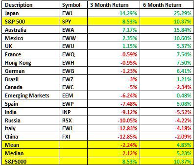
While the S&P 500 (SPY) makes new highs, this is far from the norm across the globe. Large divergences have developed, notably in the last three months. It is widely established in Dow Theory and other schools of thought that markets seldom move independently, and when one market moves up without the support of others, caution should be raised. Divergences are currently developing across world equity indices.
Thoughts on the above:
- The most recent 3-month S&P 500 rally has not been broad based and lacks support from world equity markets
- More red in the 3-month returns than 6-month returns indicates global equity markets could be rolling over
- The prior 3-month rally can be considered a healthy rally as it was broad based, but the same can't be said about the most recent 3 months
One should consider the implications of these global divergences. The US is not isolated from the rest of the world, and struggling world economies pose difficulties despite the strength and resilience of Mr. Bernanke.
US Equity Market Breadth
Divergences are also occurring within US equity markets themselves. While the S&P 500 and the Nasdaq were strong last month, the Russell 2000 was flat and transports negative.
Description
|
Symbol
|
1-Month Return
|
3-Month Return
|
S&P 500
|
SPY
|
2.09%
|
8.53%
|
Russell 2000
|
IWM
|
-0.89%
|
7.45%
|
Dow Transports
|
IYT
|
-2.03%
|
9.71%
|
Nasdaq
|
QQQ
|
2.09%
|
4.69%
|
Bonds
There have long been fundamental relationships between bonds and equities. Since 1998, bond yields typically lead equities, and certain bond market relationships have also been reliable as leading indicators.
A ratio chart of treasuries to corporates (LQD:IEF) is one such leading indicator. This ratio is highly correlated to equity market direction, but has recently diverged. Notice the positive correlation in the lower chart until recently, and the divergence between the ratio and the S&P 500 in the main chart. (Red line is a LQD:IEF ratio chart, and green line is the S&P 500) 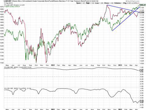
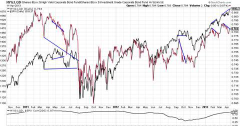
A high yield (HYG) to corporates ratio chart (HYG:) displays a similar relationship, and has had an incredible record of predicting corrections over the last two years. These two ratio charts are correlated to equities because they illustrate risk appetite. When investors are confident, they buy stock and riskier bonds. Accordingly, these ratio charts can illustrate changing sentiment not yet experienced in broad market equity indexes.
Note in the below charts that this ratio (red and black line) often displays weakness prior to corrections in the S&P 500. Each pair of blue lines displays a divergence: the HYG:LQD ratio going down while the S&P 500 goes up, and then a correction. There are some minor false signals, but when taken in context of other "red flags," it is very predictive. (Note that the final divergence currently being experienced suggests an impending correction. Further, while the previous pullback was far from a meaningful correction, the relationship was still predictive).
A final divergence between bonds and equities is evident in the US ten-year note . As mentioned earlier, since 1998 bond yields have led equities, and we can see above that a large discrepancy exists between the direction of the ten year and the S&P 500 over the last month or so.
(click to enlarge)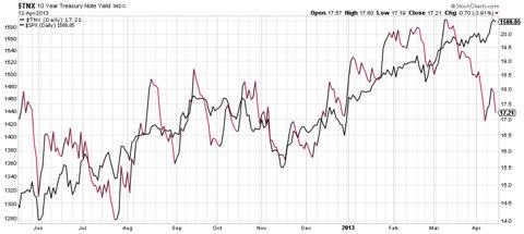

Just as bond yields lead equities, equities lead the economy, or GDP. A long-term chart of this provides further perspective.
(click to enlarge)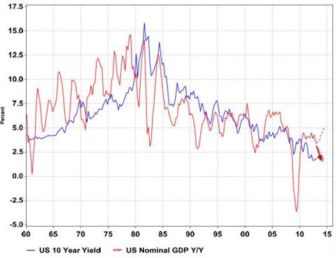
Copper and Industrials
Yes, this divergence has been debated for a while now. But what is more convincing, a shorter, smaller divergence, or a longer, wider divergence? I believe history would suggest the latter. Further, the divergence has become historically large in recent months.
(click to enlarge)
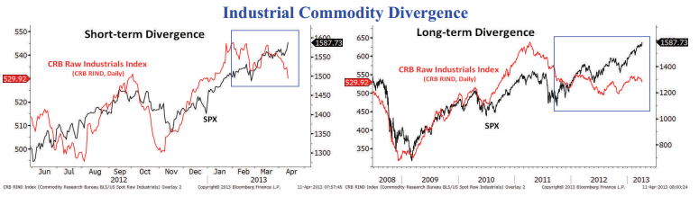
Source: http://nautilus-cap.com/
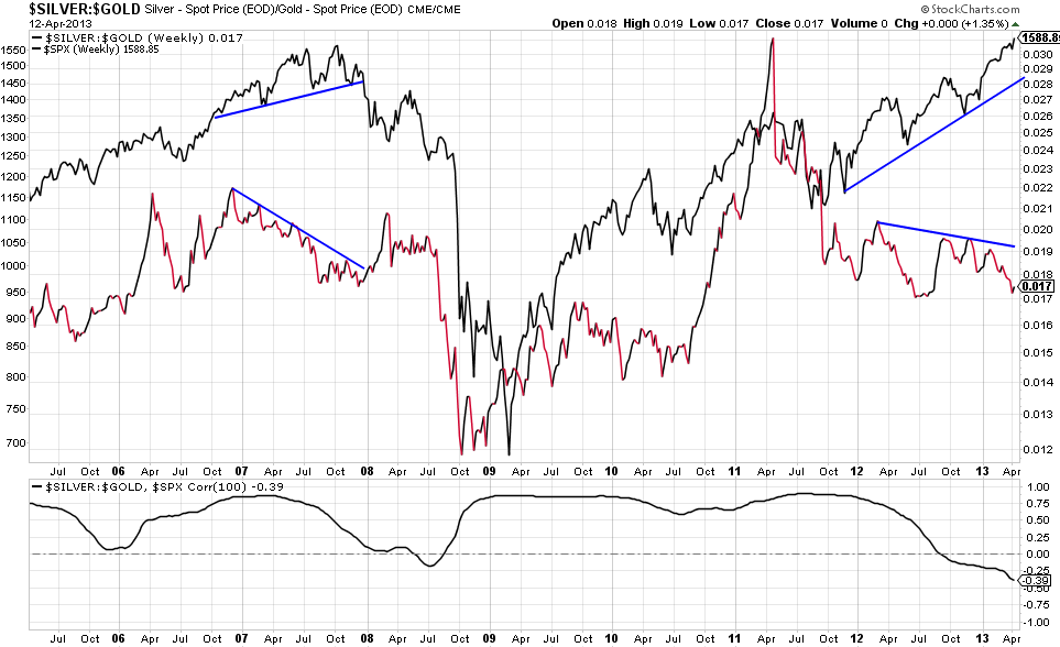
While the divergence in copper (JJC) and industrial metals is widely discussed, one relationship I believe deserves more attention is the silver (SLV) to gold ratio (GLD). Silver is both a precious metal and an industrial metal. It typically benefits from a strengthening economy, and accordingly, will rise. On the other hand, gold can be a safe haven in times of uncertainty, so it is often bought in deteriorating economic conditions. Not surprisingly, one can see below that until recently there has been a strong positive correlation between the SLV:GLD ratio and the S&P 500. However, since 2012 a divergence has emerged, indicative of a weakening global economy. The same divergence appeared in 2007; the ensuing result needs no mention. Also note that the April 2011 correction in this ratio preceded the equity market correction in the summer of 2011.
(click to enlarge)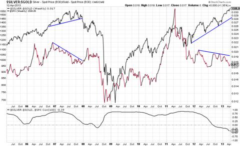
2) Economic Analysis
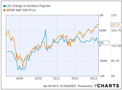
Nonfarm Payrolls
In the theme of negative divergences, yet another is being experienced between nonfarm payrolls and the S&P 500. Historically there is a high correlation between nonfarm payrolls and the S&P500, however this appears to have broken down since 2012. One can postulate that QE has created the divergence and that as long as QE is continued this divergence can be maintained. However, investors should be wary of a potential "after-party" hangover effect once the Fed starts to tighten policy.
(click to enlarge)
Labor Force Participation Rate
While the unemployment rate continues to drop in the U.S., which on its own is considered healthy, the labor force participation rate has hit lows not experienced since 1979. Less people working and more people retiring and needing social benefits is not a bullish development.
(click to enlarge)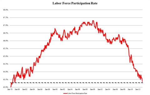
3) Sector Analysis
Sector analysis provides an indication of the current state of the economy. Relative strength in speculative, cyclical or small cap stocks, for example, typically occurs at the beginning of economic expansions while relative strength in defensive sectors typically is seen at market tops.
Dividend Paying Stocks
The first chart here shows a ratio chart of SPY to dividend paying stocks (SDY), along with a SPY overlay (black line). Note that when SPY:SDY rises, SPY rises. This reflects investor sentiment as investors want exposure to returns through price appreciation when the outlook is good, and prefer dividend stocks when the outlook is not as good. However since the fall of 2012 SDY has outperformed (denominator of the ratio chart) while SPY has continued up. This illustrates that investors are becoming increasingly cautious and "risk-off"; preferring dividend stocks over non-dividend paying stocks.
(click to enlarge)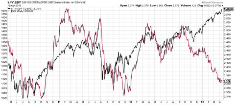
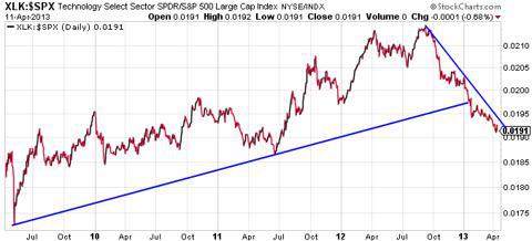
Technology
Technology (QQQ) typically leads the market. People often speculate through tech, and weakness points to a reduction in risk appetite, and accordingly less conviction for further equity strength. The below chart is a ratio chart of technology to the S&P 500. From 2009 onwards Tech outperformed and led equities up. However the downtrend since fall of 2012 suggest that technology has been underperforming recently and may be leading the market down.
Staples
Staples (XLP) strength, compared with technology underperformance, is not a bullish environment. Since March staples have been very strong; note the strong outperformance (steep blue line at upper right). The larger pattern appears to be a rising wedge; a breakout to the top would be bullish for staples and bearish for equity markets, while a breakdown through the bottom would reflect the converse. Staples are the most defensive of sectors and typically exhibit relative strength in deteriorating economic situations.
(click to enlarge)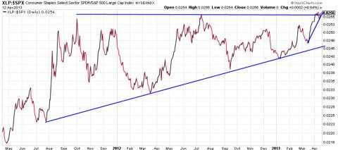

Consumer Discretionary
Consumer discretionaries (XLY) are cyclical in nature, and typically exhibit relative strength when the economy is expanding and sentiment is positive. Accordingly, a ratio chart of discretionaries to staples should provide a good indication of the health of the market. Not surprisingly, this relationship also has had predictive ability. Note the sell-off in this ratio in spring of 2011 that preceded the broader market sell-off in late summer 2011. Further, note that a divergence is currently occurring.
(click to enlarge)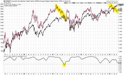

The longer-term chart of this relationship actually paints an even worse picture. First look at 2005. Both the XLY:XLP and S&P 500 made new highs. After that a divergence emerged and a peak in the S&P 500 was placed ~2.75 years later. Now look at 2011 and again we see the last high in the XLY:XLP, roughly two years ago, while the S&P 500 has diverged upwards. To ignore the divergence surely would not be prudent given the result last time.
(click to enlarge)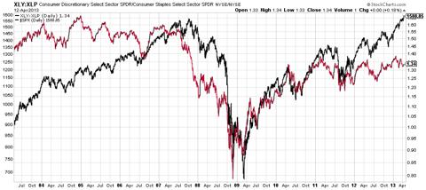

Financials
Financials (XLF) appear to be running out of steam; relative strength is subsiding and a recent support trend appears to be turning into resistance. The break of this trend however is still rather minor, and one should wait for further price action before reading too much into it.
(click to enlarge)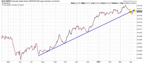

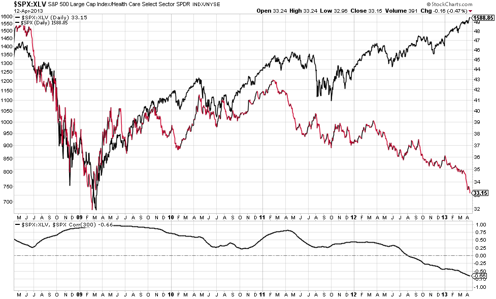
Health Care
The below ratio chart (red and black) illustrates the S&P 500 to Health Care (SPY:XLV) in comparison to the S&P 500 (note that for most other ratio charts the S&P 500 is on the bottom, this one is on the top). In a strong bull market, the S&P 500 should outperform, and in a deteriorating economic situation healthcare should outperform as it is defensive. Since 2011, healthcare has outperformed.
(click to enlarge)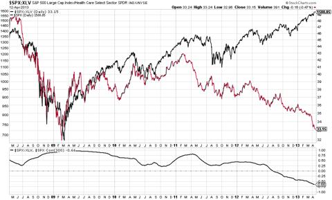
Housing
Housing has been very strong in the last year, and the below chart, as it is technical in nature, is one I am using for timing. Since the end of 2011 housing has been in a strong uptrend and a key component of the equity market rally. There are signs however that momentum is fading. The 20-week simple moving average has defined the trend quite accurately; there has not been a close below it since the uptrend crossed it. The 20-week SMA however is being tested more frequently lately, and a close below it could mark a temporary equity market top
(click to enlarge)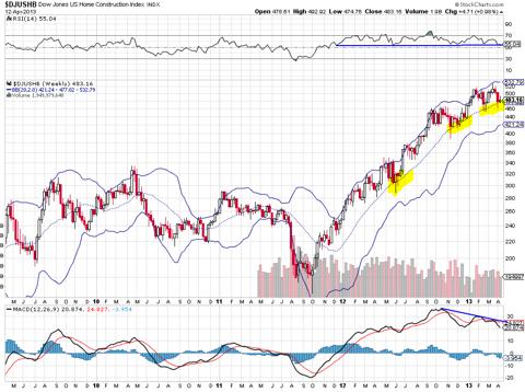
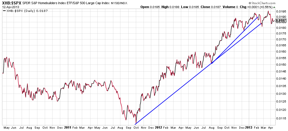
One can note below that relative strength in homebuilders (XHB) has diminished and begun breaking trend lines
(click to enlarge)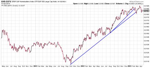
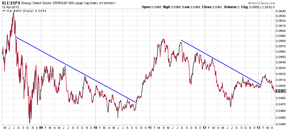
Energy
Earlier this year I thought energy (XLE) was going to break out as its recent down trend in relative strength was broken. Now it looks like that was a false breakout. The weakness in energy is not consistent with major market tops; typically energy is an outperformer. Accordingly, anyone expecting more than a 5-10% correction, if any correction, needs to question this development.
(click to enlarge)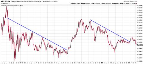
4) Cycle Analysis Shortest Term
Seasonality
Sell in May, go away (seasonality); this has been especially true in recent years. Over the last three years we have seen systemic risk re-enter the market every summer; whether it's budget issues in the US or the newest problem in Europe, the summer has not been kind. The summer period is denoted by the blue lines.
 Note in the longer-term bar chart below, March and April are two of the better months, and seasonality can in part explain the 13% S&P 500 gain since December. However seasonality truly is harsh in the summer months, particularly in September.
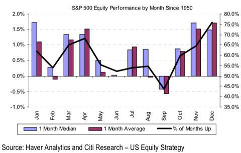
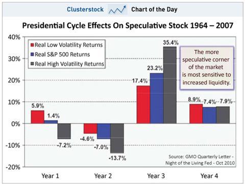
Longer Term - Presidential Cycle
Year one and two of the presidential cycle are historically much weaker than years three and four; we are currently mid-way through year one.
 Source:
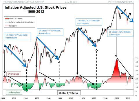
Long Term
Shorting a raging bull market? Yes, typically a bad idea, however we still are in a secular bear market. The US has only experienced two recessions in this bear, while past secular bears have witnessed at least four recessions with a duration of at least 16 years.
 Source:
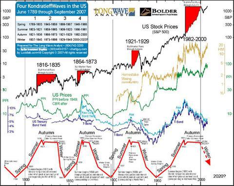
Longest Term - Kondratieff Cycle
You may think I am an uber bear by this point, but keep in mind everything I am presenting is factual. Think about all the debt in the world, can it continually build up forever? My guess is no.
I will note however that the chart above and chart below are very long term and accordingly provide minimal value for trying to time the market precisely. But they do provide perspective, and I believe one should keep them in mind as US markets continue their lone charge.
 Source:
Above is the Kondratieff wave chart, largely discussed by Ian Gordon of the Long Wave Group. Ian's long-term predictions have been very accurate to date, and his analysis suggest that equity markets are due for significant pain.
5) Technical Analysis
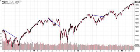
The final chart presented is a basic technical analysis of the S&P 500. For those not too experienced, I have kept it quite basic and I encourage you to read into it. A more thorough technical outlook would consider multiple time frames and other indicators, but that is beyond the scope of this article. The below chart is still quite informative; note the following:
- The 20-day simple moving average (blue line) seems to be a reliable trend indicator. As long as price closes above, the short-term trend is up. However upon a break, one can expect a minor correction
- Note three distinct corrections (thick red lines), followed by three distinct uptrends (thick green lines). This is considered a healthy market. However, note the elongation of the final trend. It is common that the bigger the trend the bigger the ensuing correction.
- Within each uptrend you will note two blue lines, which represent breakaway gaps, and effectively three legs up within each minor trend. These have been useful for determining the maturity of the trend
- At the conclusion of each trend there is a pronounced move to the upside, represented by the green channels. These represent extreme moves that typically silent any bearish outlooks and force many short sellers to cover their positions. When all bearish sentiment is cleared, that is typically when a market corrects
- At short-term tops you begin to see longer "tails" (yellow highlighted areas); often referred to as dojis, shooting stars, advance blocks, etc. When new highs are made, however price cannot close near the highs, it means sellers are stepping in and/or people are taking profits. You'll note other tails throughout the uptrends, however they are more pronounced (longer) and frequent at tops.
- On the top of the chart is the RSI and the bottom the MACD. Just as it is important for global equity markets to confirm highs in the S&P, so too is it important to have confirmation in these two momentum indicators. Note the six yellow lines all slope downwards at a point where price is still sloping upwards. This is a divergence and a warning sign of possible bearish price action to come.
(click to enlarge)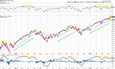
Contradictory Evidence to Short Thesis
Sentiment
This has been the most hated rally: many tops have been called, many investors are on the sidelines, and there seems to be an aura of uncertainty around the current market structure.
For example, last week the AAII sentiment survey showed that bullish sentiment reached levels not experienced since the last bear market, while bearish sentiment posted its third largest weekly spike in the history of the survey. As one can see by studying the chart below, these are typically contrarian indicators, and would suggest a market bottom, and not top.
(click to enlarge)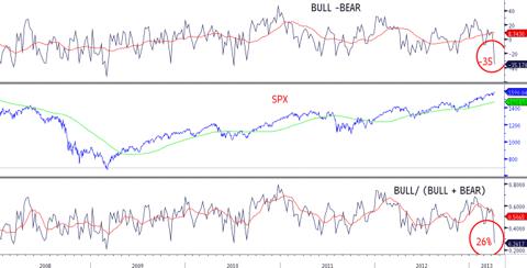
$USD
A plausible explanation for the strength in US markets over its global counterparts is recent strength in the $USD (UUP). A strong $USD typically favors US stocks over foreign stocks; US stocks will exhibit relative strength when the $USD appreciates. The actual correlation between US stocks and the $USD can be inconsistent; the point is that US stocks perform better on relative terms, they could still go down in absolute terms. In any case, this in part explains some of the global equity market divergences being experienced.
Trend
A small point, but an important one regards trend. The trend in US equities in unquestionably up. There have been many people who have tried to pick tops, and it seldom pays to do so. The most reliable investing methodology is investing alongside the trend.
It should also be noted that some of the noted divergences have been taking place for some time now, and it is possible for them to continue to grow rather than converge.
Conclusion
I may be early initiating a short, but I am looking at potentially building a position over the next couple of months. Options are cheap right now, so in my opinion it is a good opportunity on a risk to reward basis. One doesn't need to necessarily short the market, but consider buying some protection now, while it is cheap. Personally I am buying put options that expire between May and September on the S&P 500 and Russell 2000 to begin, and puts on individual stocks if/when price action suggests so.
A lot of the above analysis is longer term, and picking a top in a bull market is typically a losers game. While I began initiating a short on April 11th, I will likely look for further confirmation before I consider allocating more capital. I will also disclose that I typically make many day and intraday trades, and that I am only allocating a very small percentage of capital to this trade at this point.
As mentioned in the technical analysis, the previous 1.5 years price action has been pretty consistent. Often it's the case that when predicted patterns becomes too apparent, they then fail, or go to some new extreme that makes one question their outlook.
Further, while the longer-term secular trends suggest that a very meaningful correction should be expected in the next year or two, I am only looking for a standard 5-10% cyclical correction around the summer months. If/when that happens I will re-evaluate. There is evidence that a bigger correction can be expected soon, but there is also evidence that it may still be another year or more out.
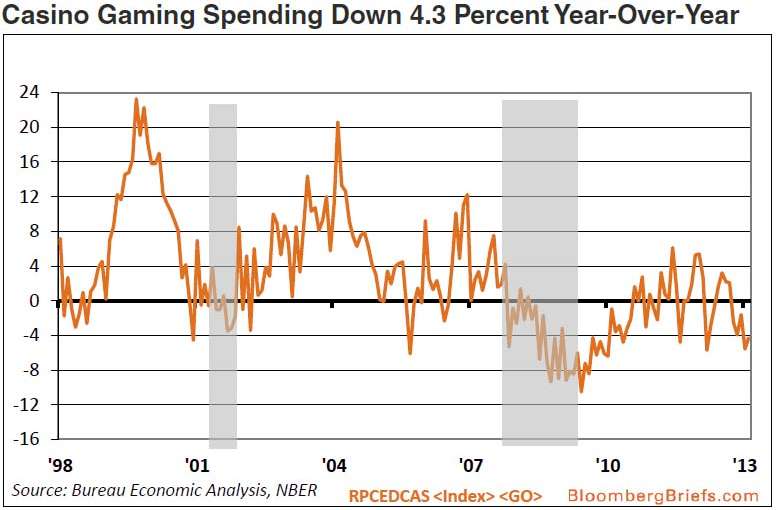
Despite all of this evidence there are many people that still will be bullish and think that I am gambling by shorting a bull market. On the theme of gambling, I thought I would provide one last chart that illustrates casino gaming spending. The shaded grey areas are recessions; note the similar levels being experienced today. Why the relationship? Casino gaming spending is reflective of consumer discretionary spending, and consumer spending is estimated to account for roughly 70% of the US economy.
(click to enlarge) Source: http://www.zerohedge.com/news/2013-04-09/broke-and-broker-us-casino-spending-tumbling-back-great-recession-levels
 Source: http://www.zerohedge.com/news/2013-04-09/broke-and-broker-us-casino-spending-tumbling-back-great-recession-levels
Outcomes that will question whether my bearish thesis are as follows:
- The mentioned divergences converge to the upside; technology, small caps, transports, financials, copper and industrial commodities, world equity markets, etc…shows signs of relative strength
- Staples and other defensive sectors weaken
- Bond relationship become positive
- Momentum indicators make new highs
- Earnings surprises, particularly in retail, technology, and financials are positive
One development that will sway my short-term bearish thesis to a longer-term one would be a crash in WTI crude oil (USO) prices, or a weekly close below $85 to begin. While WTI crude has not soared as it has in past market tops, Brent crude (BNO) had reached high prices. On Friday gold crashed, and it, along with other commodities, have been weak. Gold prices often lead other commodities, Brent crude has been sold down recently, gasoline (UGA) has been weak, and WTI experienced a sharp sell-off on Friday. Given the extended consolidation in WTI, a breakout to the downside should raise caution to the most bullish of investors.
I'd like to note that some charts are posted as of Thursday's close while others are from Friday's.
I'd like to give Credit to John Murphy as his work, notably his most recent book "Trading With Intermarket Analysis" has created the foundation to which a lot of my analysis is based on.
Disclosure: I am short SPY, IWM. I hold multiple long and short positions on individual stocks not mentioned in this article. My time frame varies substantially, from minutes to months, and my holdings accordingly change frequently. I wrote this article myself, and it expresses my own opinions. I am not receiving compensation for it (other than from Seeking Alpha). I have no business relationship with any company whose stock is mentioned in this article. ...
No comments:
Post a Comment